Have you ever wondered why the internet looks the way it does?
Why is the logo of Facebook, Twitter (X), LinkedIn, and Intel always Blue?
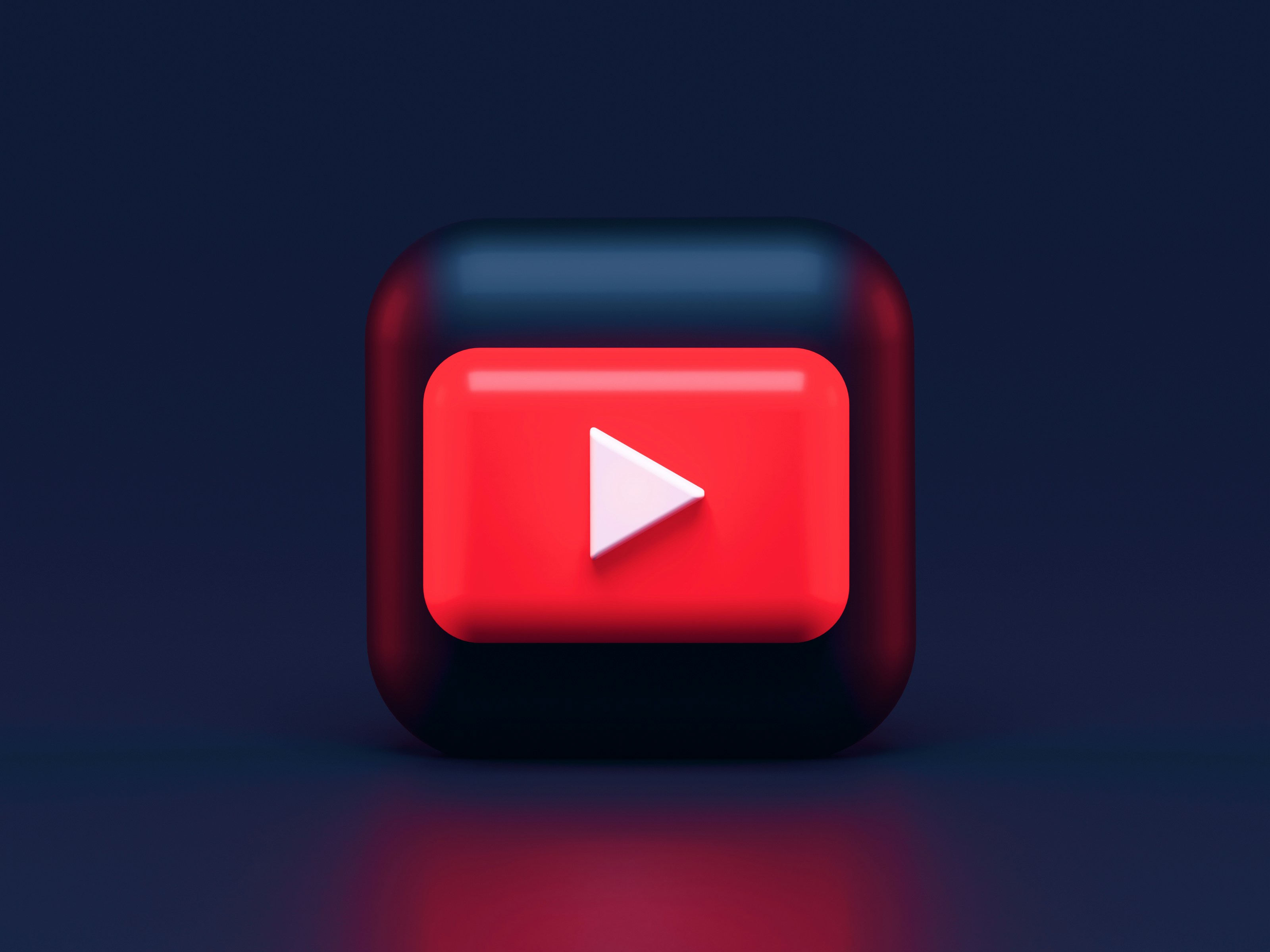
Why are YouTube, Netflix, Coca-Cola, and McDonald's always Red?
It is not a coincidence. It is not an artistic choice. It is pure Marketing Psychology.
Billion-dollar companies spend millions researching how specific colors trigger specific chemicals in your brain. Today, we decode the secret language of colors that brands use to control your decisions.
1. The Trust of Blue (The "Safe" Color)
In the tech and financial world, Blue is King.
Look at your phone. Facebook, Messenger, Safari, PayPal, Visa, Samsung, HP, Dell—they are all blue. Why?
Blue is associated with Stability, Calmness, and Trust.
Social media platforms and banks want you to trust them with your personal data and money. Blue lowers your blood pressure and makes you feel "safe." If Facebook were Red, it would subconsciously feel like a "Warning" or "Danger," and you wouldn't share your private life so openly.
2. The Urgency of Red (The "Hungry" Color)
Now, think about food and entertainment. McDonald's, KFC, Pizza Hut, Zomato, Netflix, YouTube.
Red is the most intense color. It raises your heartbeat and creates a sense of Urgency and Excitement.
In Food: Studies show that the color red actually stimulates appetite. That's why almost every fast-food chain uses red in their logo.
In Tech: Netflix uses red to create excitement. A red "Play" button or a red "Subscribe" button demands immediate action. It makes you click without thinking.
3. Green: Money and Relaxation
WhatsApp, Spotify, Android, Starbucks, Whole Foods.
Green is the easiest color for the human eye to process. It represents Health, Nature, and Wealth.
- WhatsApp uses green because it wants you to chat for hours without straining your eyes.
- Spotify uses green to help you relax with music.
- Starbucks uses green to promote a sense of relaxation and eco-friendliness.
4. Yellow & Orange: The "Cheap" & Friendly Colors
Snapchat, McDonald's Arches, Amazon, Nickelodeon.
Yellow represents Happiness, Youth, and Optimism. It grabs attention faster than any other color (that's why warning signs are yellow).
Orange is often used to represent Value or Affordability. Amazon’s orange arrow makes the brand look friendly and accessible to everyone, not just the rich.
Conclusion: Are You Being Controlled?
Next time you open an app or walk into a store, look at the colors around you.
These brands are not just selling products; they are hacking your biology. As a smart consumer, understanding color psychology helps you realize when you are buying something because you need it, or because a specific color triggered an emotion in your brain.
Frequently Asked Questions (FAQ)
Q: Does Dark Mode affect color psychology?
Yes. Dark mode reduces the emotional impact of brand colors but increases the feeling of "Luxury" and "High-Tech." It is also easier on the eyes, which keeps users on the app longer.
Q: Why do most "Sale" signs use Red?
Red creates urgency (FOMO - Fear Of Missing Out). It tricks your brain into thinking, "Hurry up, or you will miss this deal!"